Logo

Our passion incorporated in the i in our logo
The i in ink represents a person, and its red color expresses our passion and desire to take on the challenge of continuous value creation.
We refer to the red in our logo as “TOKYOink Red”.
Key Visual

Key Visual and Concept
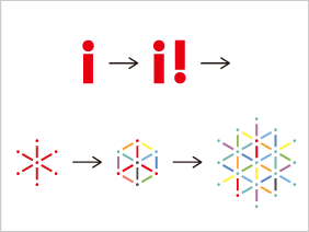
Our motif is "i" (people) Connections between people create synergies. Those synergies produce many "!" (flashes of inspiration).
Each of our customers and employees with different personalities connect together to take on challenges. That produces exciting ideas. We then grow as a company together with our customers, employees and people in society. This is what our key visual expresses.
